DIRECTV’s set-top-box (STB) user interface had not been majorly refactored in over 10 years. As a result, the business faced limitations in effectively promoting the methods in which to buy and watch content. Due to the rigid and slow hardware and underlying platform, “quick-turn” campaigns were unsupported resulting in lost revenue opportunities, and long-term campaigns required heavy development and were obsolete by the time they were launch.
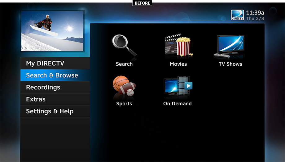
Additionally, key customer pain-points were not being addressed holistically, resulting in high support call volume and lagging customer satisfaction.
Directing a team of UX & UI designers, writers, researchers and design developers, this was my approach.
DESIRED EXPERIENCES (DX’s)
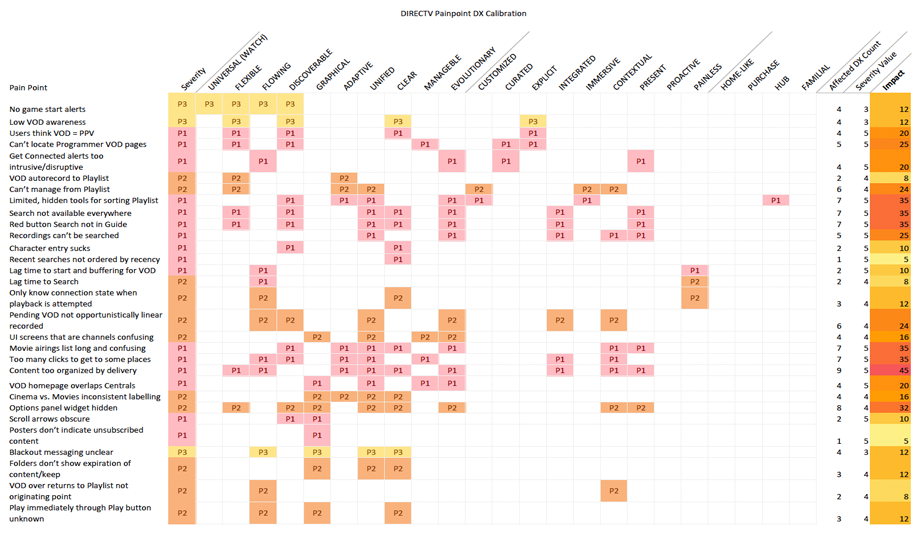
To generate quantitative measures for qualitative goals, we developed “Desired Experiences”, a systematic approach to identifying the outcomes we intended for our customers. After performing an exhaustive analysis of our collected qualitative research, we identified the core universal product needs. For instance, a DX abbreviated to “Graphical” might mean “The TV interface can be figured out without having to read much content on the screen.” Or “Unified” meaning “The TV gives me one clear way of making choices, it doesn’t make me decide how to decide”.
We then performed internal and competitive benchmarks against the DX’s, when paired with business goals, allowed us to weight and prioritize areas of product focus.
DESIGN GOALS
Deep analysis of our customer feedback channels revealed a core set of customer pain-points with the existing solution.
They fell into two primary sentiments:
“TV is supposed to be fun … this feels like work!”
“This feels outdated.”
As a result, I developed and championed a set of key product design goals and principles to inform decision-making and ensure alignment with our business and technical stakeholders.
Product Goals
Design Principles
DESIGN, ITERATION & TESTING
With goals and design objectives in-hand, the team facilitated multiple rounds of ideation and whiteboard sessions, ensuring to include our product, technical and content partners. This inclusive approach ensured we were garnering the collective creativity from many perspectives, aided insight into technical or business limitations, and garnered buy-in to the solutions being explored.
Once promising ideas and concepts were captured, a weekly cadence of customer interviews and co-design sessions was established to ensure our ideas resonated with the target users. With ideas and suggestions coming directly from the customer, we quickly generated low-fidelity prototypes to ensure remote control interactions worked seamlessly with the designs. Developers actively participated in the user studies, and as a result, we were able to quickly modify problematic flaws in the design, sometimes making same-day modifications.
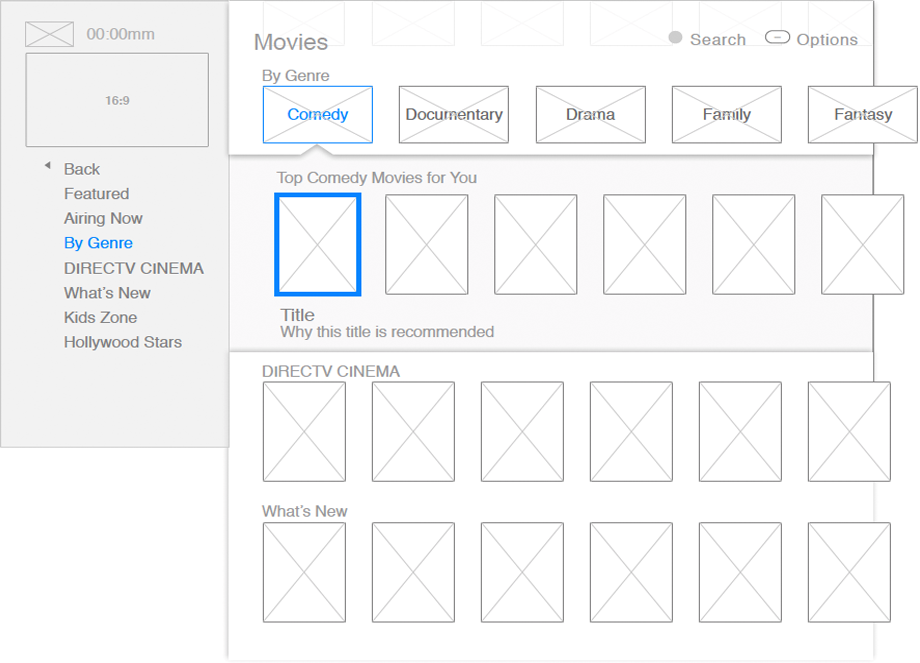
After rapid iteration and validation testing, we finally coalesced upon a successful interaction model that achieved our design goals. With visual explorations being conducted in parallel, the end product began to take shape. Once developed, additional user testing was conducted on the target hardware, with refinements continuing.
An initial MVP was delivered to users in November 2017, which allowed us to actively monitor usage and ensure our intended solution held up in the real world. After further refinement, the new DIRECTV experience was shipped to 20 million paying subscribers in the summer of 2018.
KEY SCREENS
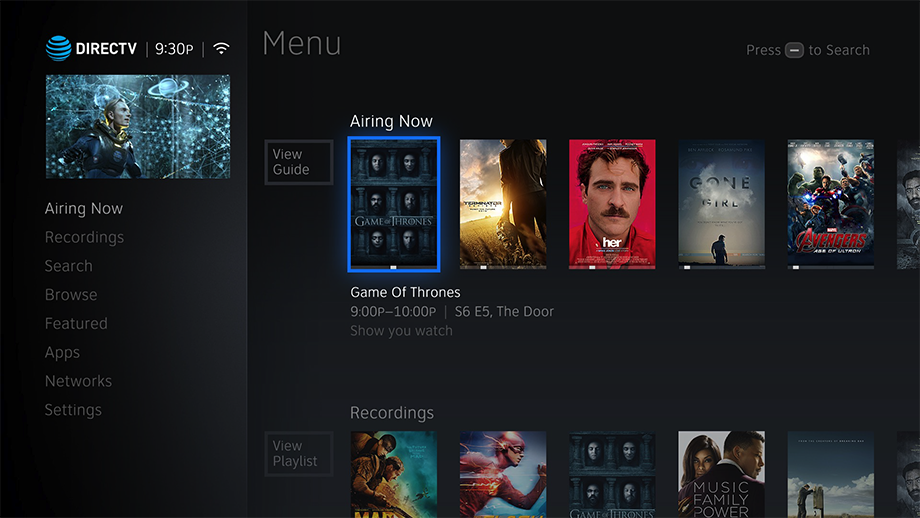
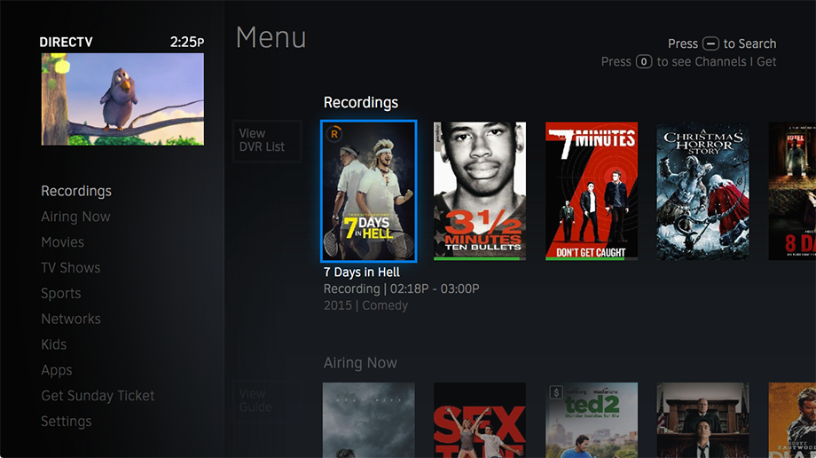 Menu Screen (Home): Recording progress indication, resume points, and rich metadata displayed without a button press. Search is now available from every screen.
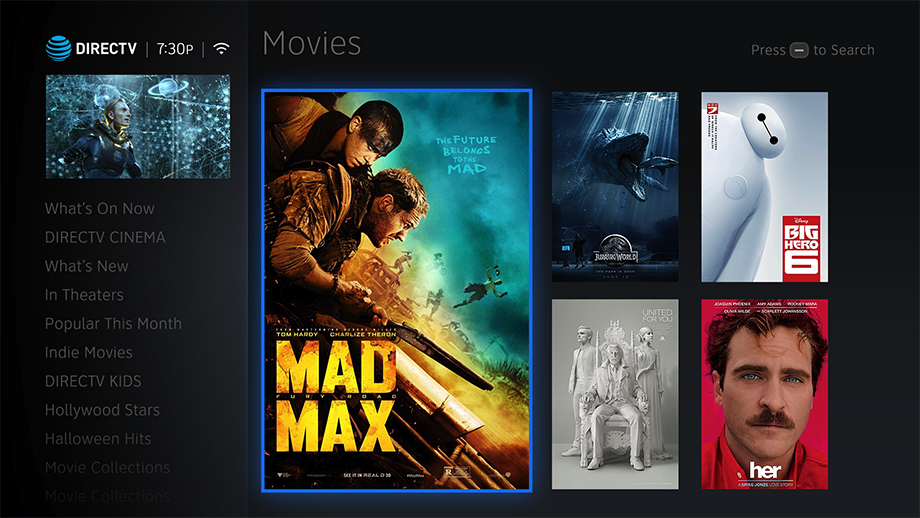 Movies: Rich content details pages to better inform purchase/watch decisions.
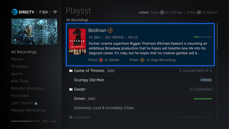 Playlist (DVR): Recordings with exposed filters and grouped advanced management options.
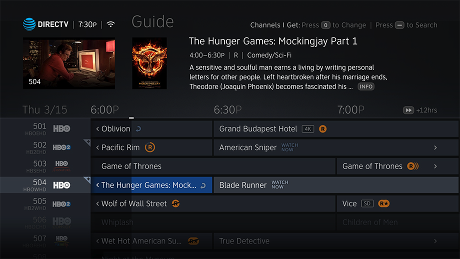 Channel Guide: Clear indication of time passed, true inline VOD integration (WATCH NOW), remote access to filter and search.
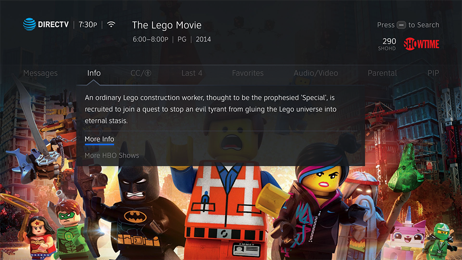 Info Panel: Contextual actions and access to key information without losing context of what is being viewed.
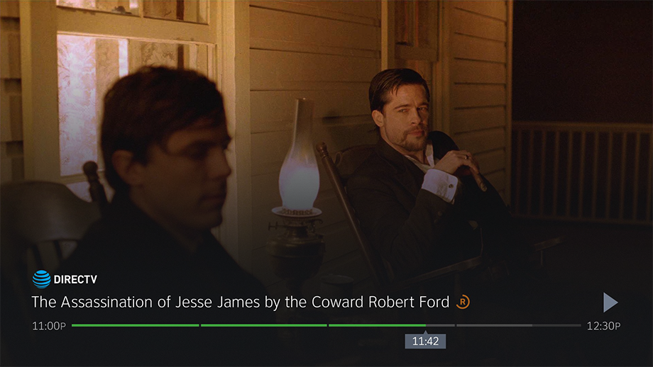 Media Transport Control (MTC): Obstructing less of the screen while serving up key system feedback.
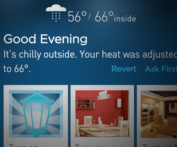
Home security and smart home control
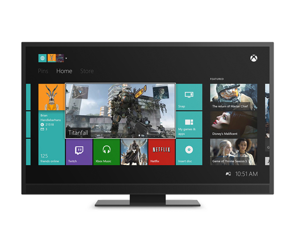
Next-generation gaming platform
Cross-screen entertainment ecosystem
Image recognition and AR mobile app and web site